I’ve been in New York for almost eight years now, and I still don’t think I’m used to how long its winters last.
Growing up in North Carolina, the temperature rarely dipped down enough to need more than a pea coat. I have spent quite a few Thanksgiving and Christmas days in short-sleeved shirts and dresses and usually by this time of year, spring is well on its way.
While it was a little strange to begin working on this blog when snow blanketed the city just a few days ago and our winter wear is still in use, it is helping me be optimistic about the warm weather to come.
I spent the fall 2017 edition of this blog post gushing about how much I loved the season and while that’s true, I’m very happy to now be on the other side of winter. Spring shades are warm and happy, and I can’t wait to see the flowers popping up in the colors of the season.
According to Pantone, “colorful self-expression” is a key takeaway for spring 2018. For the season’s colors, Pantone selected “a kaleidoscopic bounty of uplifting shades and feel-good tones” and balanced them out with some neutral or classic shades.
I have paired each with one jewel in a color that I think coordinates with it.
The 12 trend-driven shades
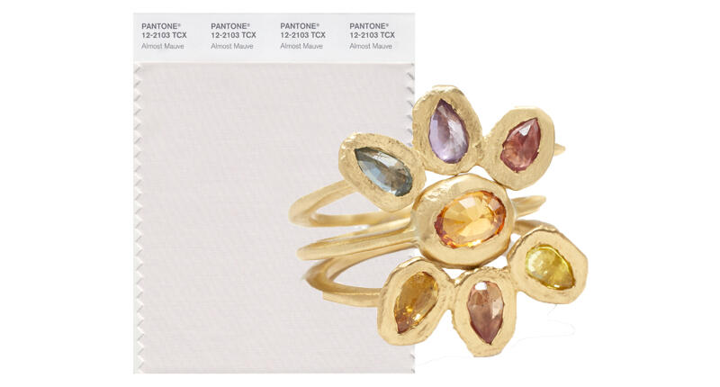
Almost Mauve. This shade is so light that I kept going back and forth between a number of different colors that I thought would add a nice pop. And then I thought, why choose? Instead, I’ve given it a rainbow with this ring stack from Page Sargisson. All three feature sapphires set in 18-karat gold ($715 each for the two rings on the outside; $475 for the ring in the center).
Arcadia. This shade is invigorating and energizing in the way that many vibrant green or greenish hues can be, but I found it to be difficult to color block with anything other than a neutral, in particular a nice white hue. These “Fairy Companion” studs from Soulbound are inspired by fairies from the Legend of Zelda and feature 3 mm Japanese cultured pearls in 14-karat gold ($245 for single stud; $440 for pair).
Blooming Dahlia. There’s something satisfying and refreshing about a pink-gray combination. This color has a bit of a salmon hue to it, but I still think it goes so well with gray. So I matched it with Daniella Kronfle’s “Butterfly” necklace, featuring gray agate and diamonds in 18-karat rose gold ($3,600).
Cherry Tomato. How happy does this color make you feel? I adore it and its vibrancy. But, because it is so much color, I opted for a neutral to offset it, in particular a nice, soft pink. This necklace from Ruta Reifen, comprised of ruby, rainbow moonstone, pink sapphires and morganite set in 14-karat gold, is perfect ($1,560).
Chili Oil. This color almost takes me into summer time—the heat of the afternoon, grilling, long days—but I’m going to let it stand on its own and keep it simple by pairing it with black. For that, I’ve complemented it with this necklace from Melis Goral’s “Dark” collection, featuring onyx and diamonds set in 18-karat white gold ($2,850).
Emperador. I’m going to be honest here and say that I had to search a bit on this one for inspiration. I don’t wear brown and I don’t own a lot of brown items, but to me it made the most sense to liven this neutral up with the crisp, pretty whites of a pearl. These are the “Ada” earrings from Selin Kent featuring pearls about 10 mm in size with 0.25 carats of diamonds in 14-karat gold ($1,750).
Lime Punch. While I like this color, it’s a lot. I can’t imagine pairing it with any other colors than a neutral. To tone it down, I like it with a dark gray or black, like the spinel in this Syna necklace set in 18-karat yellow gold ($1,350).
Little Boy Blue. This color reminds me of a slightly darker version of Serenity, which was one of two colors of the year for 2016. But rather than pair it with a soft, warm color, I decided to give it the same-family treatment and put it with a darker, deeper blue. It’s pictured here with Theresa Kaz Jewelry’s 18-karat gold “Sunburst” ring, which features a halo of diamonds and rays of tapered baguettes sapphires around a moonstone center that perfectly accents the colors ($3,200).
Meadowlark. This shade is so quintessentially spring, and I can’t wait to see the flowers it mimics blooming around the city. Using a good color-blocking rule, I love to pair warm shades with the cooler ones on the opposite side of the color wheel, so I’m putting Meadowlark with this ring from Jeffrey Bilgore featuring a 10.92-carat blue sapphire and diamonds set in platinum (price available upon request).
Pink Lavender. I gave this shade—which resembles a darker Rose Quartz, no?—the same-family treatment as well and paired with a sister shade that’s slightly richer. It’s seen here with Moritz Glik earrings featuring 2.3 carats of pink sapphires, 1.65 carats of amethyst and 0.12 carats of diamonds set and enclosed between double-domed white sapphire crystals in 18-karat rose gold ($4,400).
Spring Crocus. I flock to a purple of this shade pretty often. Just as the name suggests, I’m taking inspiration from the flower itself, with a purple outside and a vibrant yellow to go with it. These are M. Spalten’s “Starburst” studs, featuring princess-cut yellow sapphires and diamonds set in 18-karat yellow gold ($1,240).
Ultra Violet. Ah, Ultra Violet, the star of 2018. I saw a lot of positive responses when Pantone announced this as the color of the year; I think pinks and purples have really been speaking to people lately (a lot of what I heard in Tucson affirmed this.) In that vein, I’m color blocking it with a vibrant pink—Campbellian Collection’s ring featuring a 10.54-carat pink tourmaline at center accented with 1.57 carats of pink spinel and 0.58 carats of diamonds in platinum and 18-karat white gold ($9,000).
For the first time, Pantone released a “classic color palette,” since the classics are a mainstay for so many wardrobes. The four neutral shades are also meant to dominate the season, providing a wearable counterpart to the vibrant group of 12 shown above.
Some of these classics are just begging for pops of color.
The classic color palette
Coconut Milk. A blog about spring colors didn’t seem right without the vibrant look of Paraiba tourmaline in it, so I was more than happy to slip the gemstone in here to give this white a boost. This ring from Sutra features 8 total carats of Paraiba and 5 carats of diamonds in 18-karat white gold (price available upon request).
Harbor Mist. I thought this color would mix well with any piece that also had slight gray undertones to it. This heart ring from Hi June Parker Fine Jewelry’s Plaza collection, featuring tanzanite and sapphires set in 14-karat yellow gold, is perfect ($2,335).
Sailor Blue. There was something about this deep blue/deep maroon pairing that I couldn’t get out of my head once I saw it; it’s rich and luscious. I’ve partnered this navy with an Omi Prive ring featuring a no-heat 4.01-carat ruby from Mozambique and diamonds in platinum and 18-karat yellow gold ($320,000).
Warm Sand. There are plenty of organic, earthy brown stones that deserve some love, so I thought a lighter sand color would be perfect to pair them with. Here, Warm Sand is color blocked with these Dalseen Jewellery boulder opal and 18-karat rose gold earrings (£13,000, or about $18,200).


.")
.")
.")
.")
.")
.")
.")
.")
.")
.")
.")
 In that vein, I’m color blocking it with a vibrant pink—Campbellian Collection’s ring featuring a 10.54-carat pink tourmaline at center accented with 1.57 carats of pink spinel and 0.58 carats of diamonds in platinum and 18-karat white gold ($9,000).")
.")
.")
.")
.")


 USA’s new online sales training video series.")
 organized large-scale vaccination drives for cutters, polishers, and other diamond industry employees. The World Federation of Diamond Bourses, Gem & Jewellery Export Promotion Council, and the Bharat Diamond Bourse (BDB) supported GJNRF’s efforts. Pictured is a drive held at the BDB.")
” will offer jewelry that belonged to Tsar Ferdinand, such as this colored diamond pin (right), as well as pieces passed down from his mother, including this ruby, sapphire, and diamond bracelet (left), and pieces made for his children. It is scheduled to take place Nov. 13 in Geneva.")